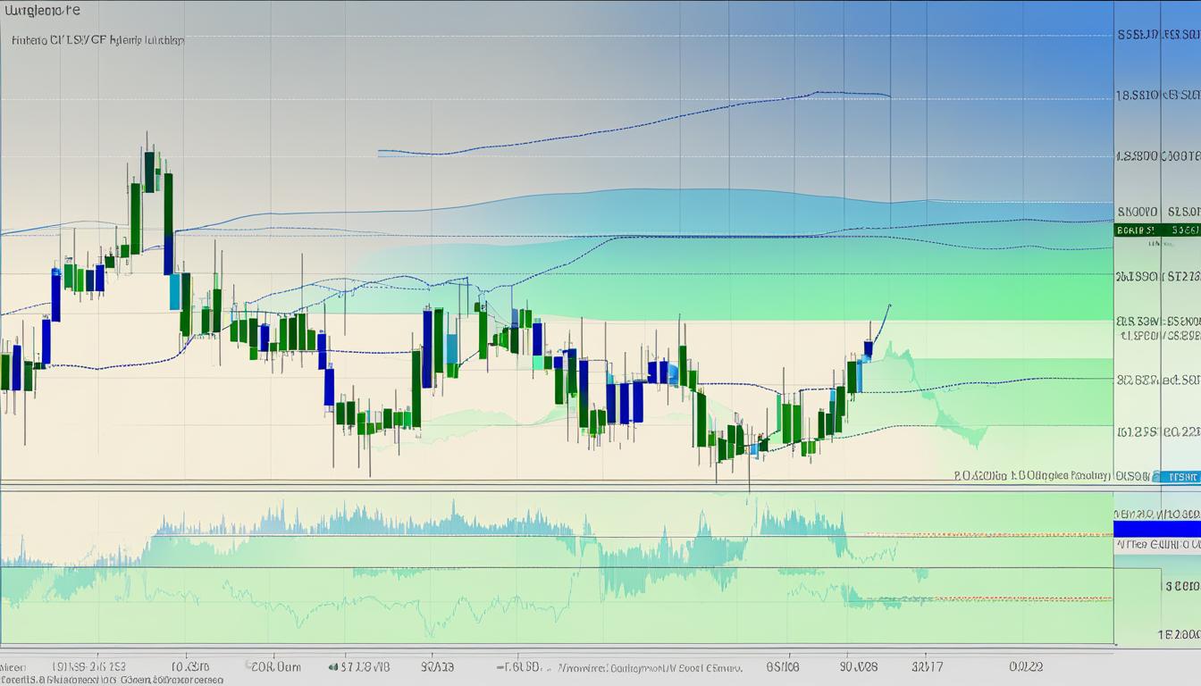
In the dynamic world of financial markets, technical analysis remains a powerful tool, and chart patterns serve as its cornerstone, providing traders with crucial insights. These patterns are the cartographers of market liquidity, highlighting the pathways for predicting price movements. Recently, the EUR/GBP currency pair demonstrated the potency of these patterns, unveiling a double-wick formation that hinted at the struggle within a resistance area, a tale of supply and demand writ large on the candlestick canvas.
Such intricate formations not only speak volumes about the current market climate but also give traders the foresight they need. When the patterns point towards a liquidity run, savvy traders take heed, recognizing the potential for a new trend waiting in the wings. Combining these insights with an acute awareness of fiscal shifts, such as interest rate policies from the European Central Bank or the Bank of Japan, can prove indispensable for navigating the often-turbulent financial seas.
Monitoring instruments like Gold against supply zones and resistance levels further underscores the relevance of integrating liquidity chart patterns for enhanced trade planning. These patterns hold the key to unlocking trading opportunities and elevating traders’ ability to skillfully capitalize on market ebbs and flows. As the tapestry of the markets continuously weaves its tales of bulls and bears, the astute interpretation of liquidity chart patterns remains essential for the traders to draft their strategies with precision and confidence.
Introduction to Liquidity Chart Patterns and Their Relevance in Trading
As the financial markets continue to evolve, traders are on a constant quest for tools that can provide reliable trading signals and insights into market trends. Liquidity chart patterns serve as a cornerstone for technical forecasting, enabling market participants to decode the intricacies of price movements and potential price breakouts. By leveraging the historical data encapsulated in these patterns, traders can make educated guesses regarding future market behaviors and adjust their strategies accordingly.
Defining Liquidity in the Context of Technical Analysis
Liquidity, in the realm of financial trading, refers to the ease with which an asset can be bought or sold in the market without affecting its price significantly. Liquidity chart patterns articulate the flow of market supply and demand, providing an illustrative snapshot of the balance between buyers and sellers. The examination of these patterns is pivotal in technical analysis, as they help traders recognize accumulation zones, distribution phases, and critical price levels that are likely to act as catalysts for market movement.
Why Chart Patterns Matter for Traders
Chart patterns empower traders with visual cues that can signify imminent trading opportunities. These patterns, whether they depict continuation or reversal formations, equip traders with actionable insights and the ability to anticipate price breakouts. The understanding of these patterns is instrumental in constructing a robust technical forecasting model that aligns with market trends and the inherent volatility of the trading environment.
Understanding Market Sentiment through Liquidity Levels
Market sentiment can be directly gauged from liquidity levels, as they reflect the overarching confidence or skepticism of participants in the asset’s future price direction. Chart patterns such as ascending triangles suggest accumulation and a bullish outlook, while head and shoulders formations may indicate a bearish reversal ahead. By tapping into the psychology of market sentiment through liquidity chart patterns, traders can align their positions with the prevailing or emerging market trends for strategic trading.
| Pattern | Type | Market Sentiment |
|---|---|---|
| Ascending Triangle | Continuation | Bullish |
| Head and Shoulders | Reversal | Bearish |
| Double Top | Reversal | Bearish |
| Double Bottom | Reversal | Bullish |
| Pennant | Continuation | Neutral/Bullish/Bearish |
Dissecting the Liquidity Run Pattern for Strategic Advantage
The liquidity run pattern is a pivotal phenomenon in financial markets that traders scrutinize for gaining strategic advantages. Understanding this pattern is essential for effective trade planning, especially when employing breakout strategies. Here’s how traders can harness the power of the liquidity run to better inform their trade decisions.
An evident double top often flags the starting point of a liquidity run, indicating reluctance for price to push higher. The subsequent break of structure is a clear signal for traders, pointing to a potential reversal or a significant extension of the trend. Astute traders watch for these powerful movements as they craft their breakout strategies, including setting appropriate stop-loss orders to manage risk.
- Identification of entry points during the initial liquidity run failure, such as price holding below a major resistance level.
- Determination of exit points by observing the vigor of market rebound and the clustering of stop-loss orders.
- Anticipation of market discomfort and the squeeze-out effect among participants holding losing positions.
When a price rebounds above a key low where stop-loss orders are prevalent, the induced market discomfort that follows can be critical to understand for taking positions against the crowd. Such conditions can lead to a liquidity run, where traders scramble to exit their positions, causing a sharp market move. This is a pivotal moment that can solidify a trader’s predictions of market downtrends and reinforce their breakout strategies.
Moreover, a high surge in the market movement due to the liquidity run often translates into an abrupt sentiment shift. Traders who monitor these sharp candle movements can capture robust trade planning insights. Careful analysis of these liquidity patterns not only assists in preempting market turns but also in framing a strategic response for entering or exiting the market.
In summary, executing well-informed trades during a liquidity run requires a trader to perform a delicate balancing act—anticipating market behavior, being quick to react to price movements, and managing risk through prudent placement of stop-loss orders. Through meticulous observation and analysis, traders can pinpoint the critical junctures where liquidity runs are likely to occur and devise strategies that leverage their understanding for successful trading outcomes.
Liquidity Chart Patterns: Core Indicators for Trade Planning
Experienced traders understand that liquidity chart patterns are indispensable tools for trade execution and achieving a deeper understanding of market forecasting. Patterns such as triangles, pennants, flags, and wedges not only signify potential trend continuation but also highlight critical moments when the market is poised for a significant move after periods of price compression and consolidation.
Conversely, patterns such as double tops and double bottoms represent classic reversal patterns that suggest a forthcoming change in the price direction. The presence of a head and shoulders formation is also a strong precursor to potential reversals, often triggering key strategic decisions among savvy market participants.
To further elucidate the practical applications of these patterns, consider the following table of common liquidity chart patterns, their implications, and their impact on trade planning:
| Pattern Type | Pattern Name | Implication | Typical Volume Confirmation | Potential Action |
|---|---|---|---|---|
| Trend Continuation | Triangle | Indicates consolidation followed by continuation | Breakout with increasing volume | Consider positions in the direction of the predominant trend |
| Trend Continuation | Pennant | Suggests a brief pause after a strong move, followed by a continuation | Breakout with substantial volume | Position for breakout in the direction of the initial move |
| Reversal Pattern | Double Top | Signals a potential peak and reversal to a downtrend | Decreased volume on second peak | Prepare for short positions or exit longs |
| Reversal Pattern | Double Bottom | Indicates a possible bottom and reversal to an uptrend | Increased volume on a second trough | Initiate long positions or cover shorts |
Traders prioritize these patterns as the volume accompanying such movements validates the trade setup and supports the consensus of the asset’s projected trajectory. In fact, their inclusion in the broader context of market liquidity is not merely a routine check but a strategic approach that greatly enhances trade planning. By mastering these patterns, traders can substantially improve the probabilities of their trade execution success.
Assessing Market Sentiment with Liquidity Chart Formations
Traders often rely on liquidity chart formations to gauge the mood of the financial markets, as these patterns serve as visual representations of buyer and seller dynamics. By interpreting these formations, investors can gain insights into the potential direction of market trends and make informed decisions accordingly. Recognizing specific chart patterns and understanding their implications for market sentiment is an essential skill for any technical analyst.
Interpreting Double Tops and Double Bottoms
Double tops and double bottoms are quintessential patterns that traders monitor for signs of sentiment shifts in the market. A double top, characterized by two consecutive peaks at roughly the same price level, is a bearish signal suggesting a possible reversal of an upward trend. Conversely, a double bottom, with its twin troughs, signals a bullish reversal after a downward trend. These formations are significant because they reflect the resistance and support levels that play pivotal roles in market analysis.
Head and Shoulders: An Indicator of Market Reversals
The head and shoulders formation is another critical indicator that technical analysts use to predict a bearish reversal in bullish markets. The pattern consists of three peaks—the middle one being the highest, flanked by two lower ones—creating a silhouette reminiscent of a head and shoulders. The ‘neckline,’ drawn by connecting the lows of the two troughs, becomes the focus for confirmation. A decisive break below this line can validate the anticipated bearish signal.
The Role of Wicks and Shadows in Liquidity Candles
Wicks and shadows on liquidity candles also provide a wealth of information about underlying market forces and trader psychology. Long wicks can indicate rejection of certain price levels while short wicks suggest acceptance. By examining these subtle cues, traders can decipher the strength of bullish or bearish signals within the context of overall market liquidity. A comprehensive analysis of these patterns, in combination with other market analysis tools, enables traders to align their strategies with the general market sentiment, staying ahead of sentiment shifts and capitalize on them efficiently.
FAQ
What Are Liquidity Chart Patterns?
Liquidity chart patterns are visual formations on price charts that illustrate the balance between supply and demand in a market. They provide insights into market liquidity and help traders identify potential price movements and trends for strategic trading.
What Is the Liquidity Run Pattern?
The liquidity run pattern, typically characterized by a double top formation and a break of structure, signals a possible shift in market sentiment and trend direction. Recognizing this pattern helps traders identify strategic entry and exit points and capitalize on market movements.


